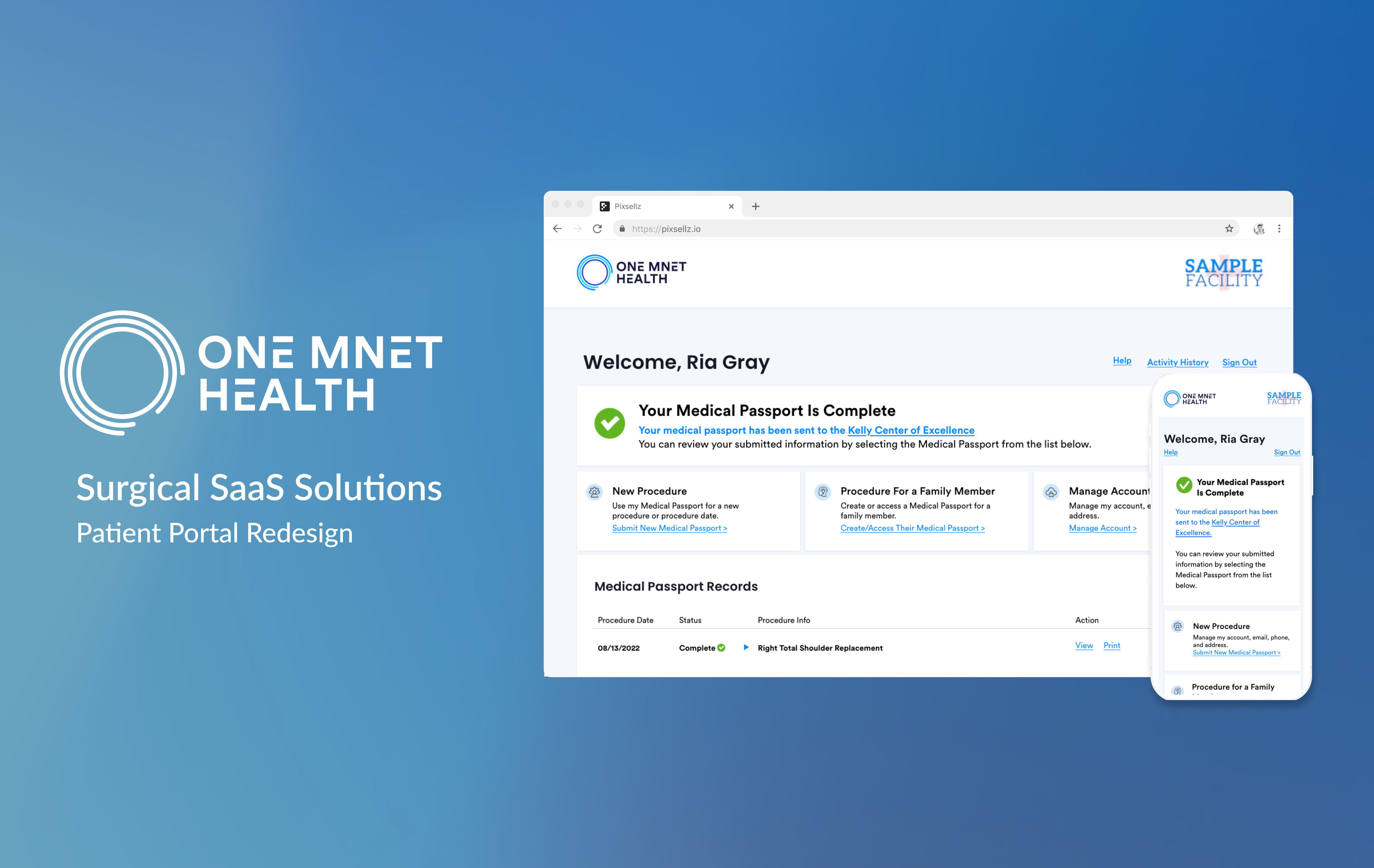
Leading Designs in SaaS Software: Optimizing Surgical Workflows
IMPACT
Results & metrics
My designs helped over 1,200 surgery centers and 15,000 clinicians streamline pre-surgical workflows, enhancing health history retrieval and documentation experiences. These improvements resulted in:
8% ↓
Total support ticket volume
1st
UX design team established
Final design
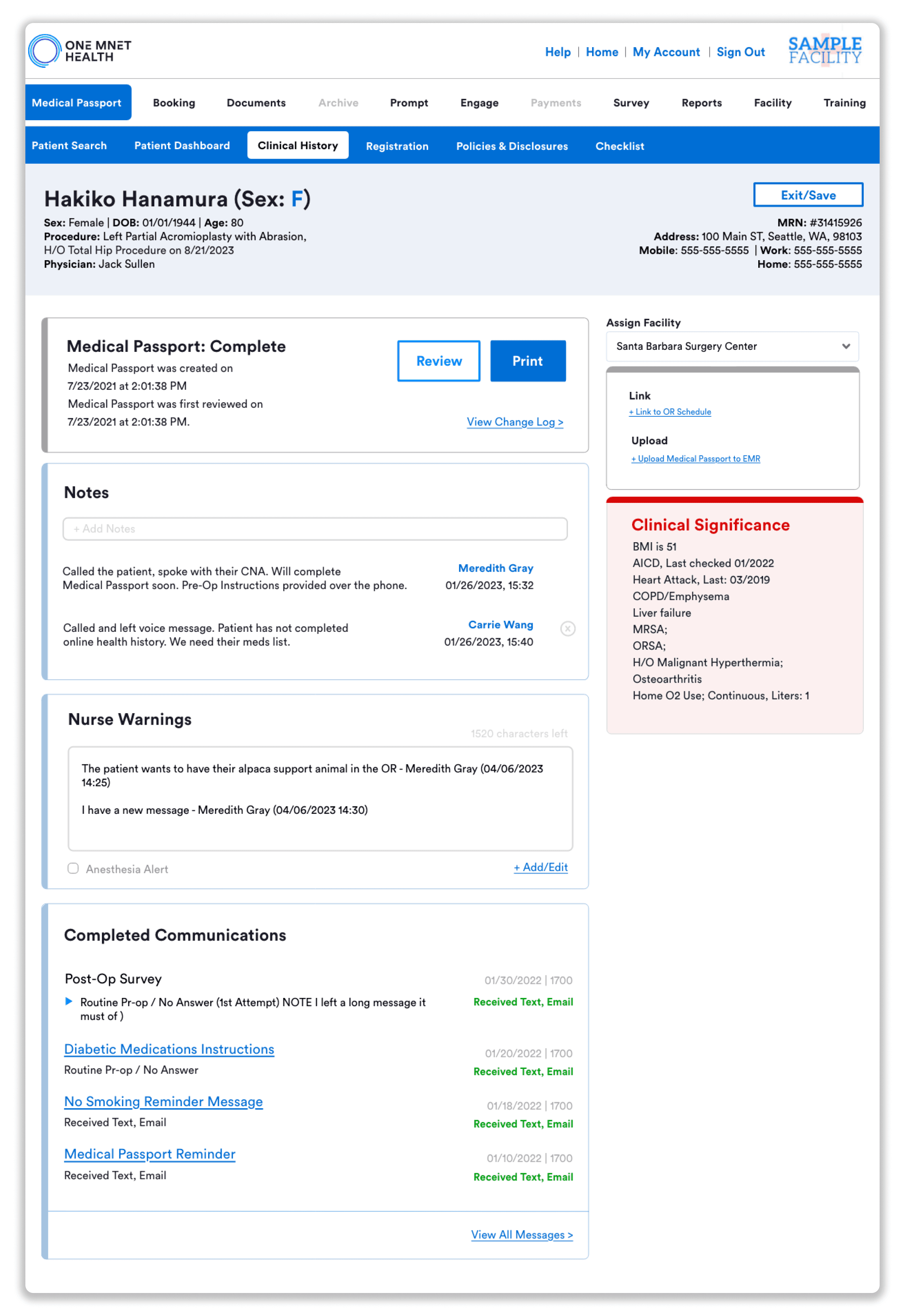
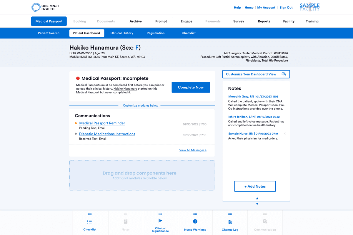
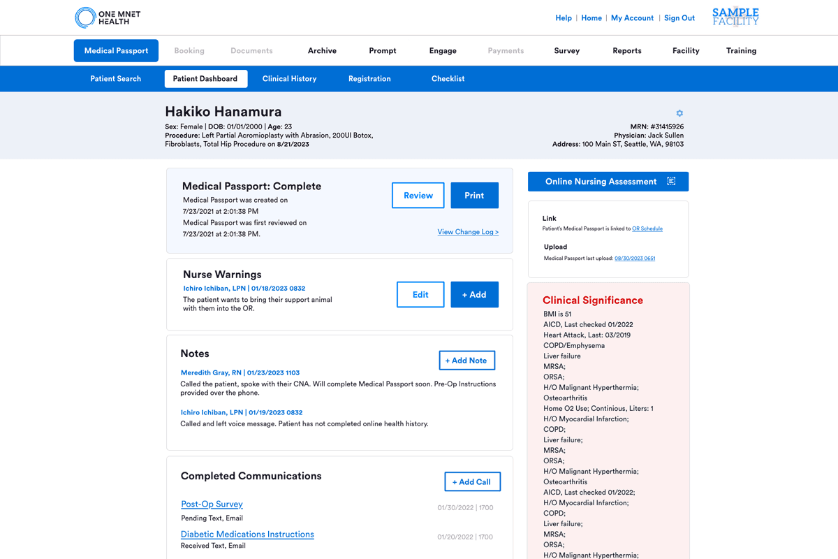
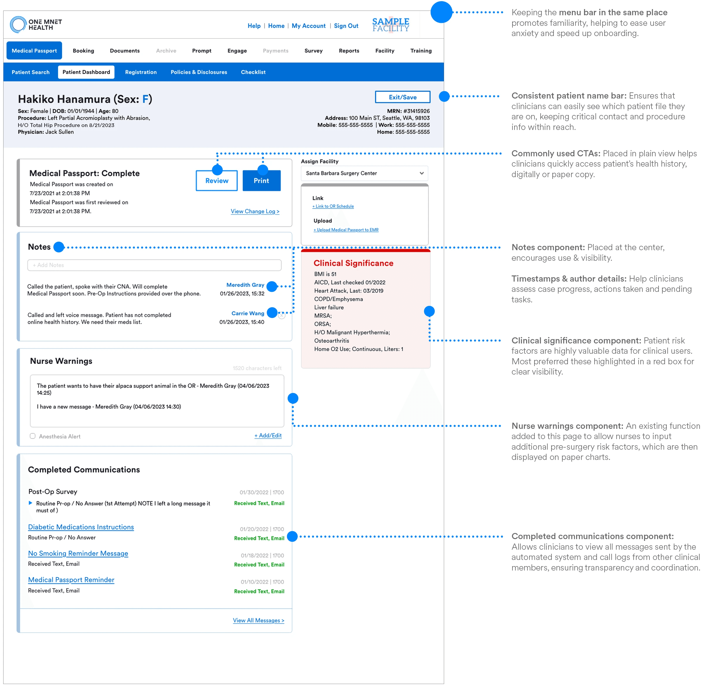
The Patient Dashboard represents the culminative efforts of the first UX design team I helped establish. As the sole UX designer and lead for interaction & visual design, I was directly responsible for content selection, information hierarchy, and ensuring the overall portal experience aligned with our brand identity.
"Patient Dashboard" page: Completed patient health history with high-risk modules, notes and communication logs.
BACKGROUND
Surgery centers use One Mnet Health’s SaaS platform, acquired from One Medical Passport, to streamline pre-op and post-op care. Patients submit their health histories and pre-op assessments via our portal, which then provides their information directly to the surgery centers for review.
CHALLENGE
User challenges
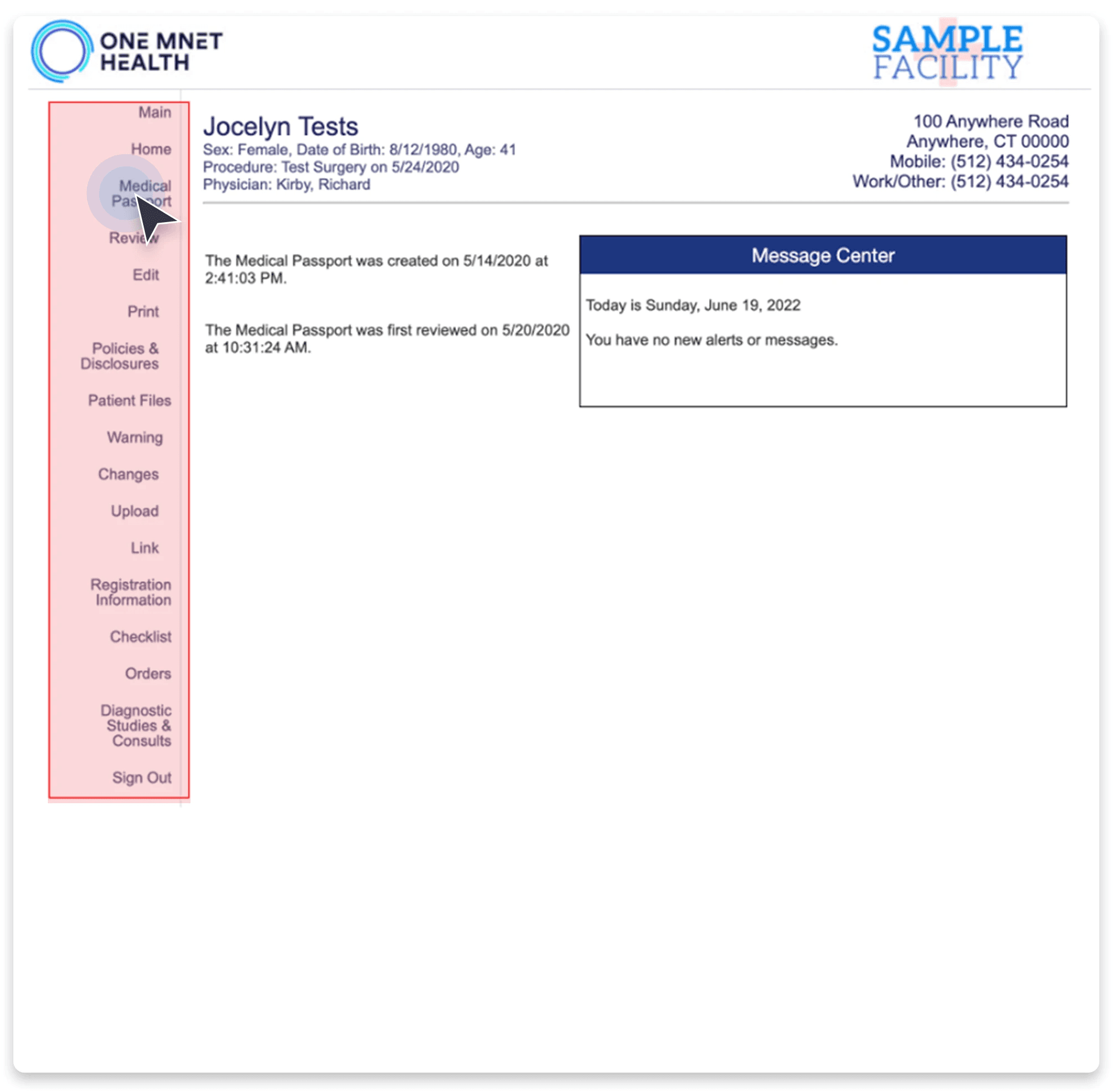
Users are frustrated by the poor usability of our surgical productivity software, due to inconsistent menu and CTA placements. Drawing from my clinical background, my goal was to address their challenges and improve their experience.
Business challenges
We faced the challenge of merging two user interfaces due to the acquisition. This merge meant we needed to align the new parent company’s aesthetics while also improving the functionalities of our solutions.
Constraints
I found innovative solutions to approaching our challenges despite my constraints listed below:
Tight deadlines
Limited resources
Competing development priorities
Restricted access to end-user interactions
PROCESS
Narrowing down the scope
In the project's early stages, we had considerable freedom to identify user pain points within our solutions. I concentrated our efforts on the high-impact areas, primarily the Facility Portal where most of our customers reside.
SURGICAL CASE WORKFLOW
Curious about the other portal's enhancement efforts? Check it out here.
Design process
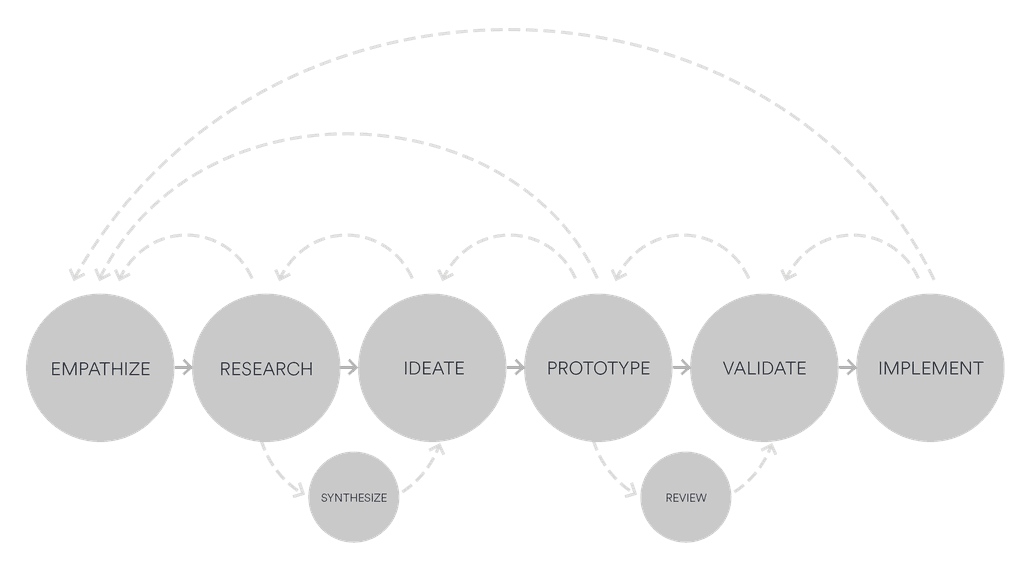
My design process follows a general linear structure, but as we all know, design is not linear but cyclical, which allows for ongoing refinement through iterative steps.
I collaborated with…
Clinical customer success manager
Sr. branding designer
Sr. Business analysts
Marketing director
Lead engineer
In the process, I helped form our company's first UX team 🎉
RESEARCH & SYNTHESIZE
Understanding the problems
Due to confidentiality, full interview details are not available. However, here’s an overview of the research process, including a heuristic evaluation and legacy user flow analysis to find our usability issues and their related business challenges.
Interviewed Stakeholders
6 Customer Success Managers:
Four with clinical backgrounds2 Business Analysts:
Focused on business challenges1 Product Support Analyst:
Assessed technical issues1 Product Support Manager:
Investigated operational challenges
Persona
Our target users within the facility portal, serving approximately 11,000 active daily users, are predominantly Pre-Admission Testing (PAT) and Post-Anesthesia Care Unit (PACU) nurses who regularly log into our pre-surgical productivity solution.
Legacy user flow analysis
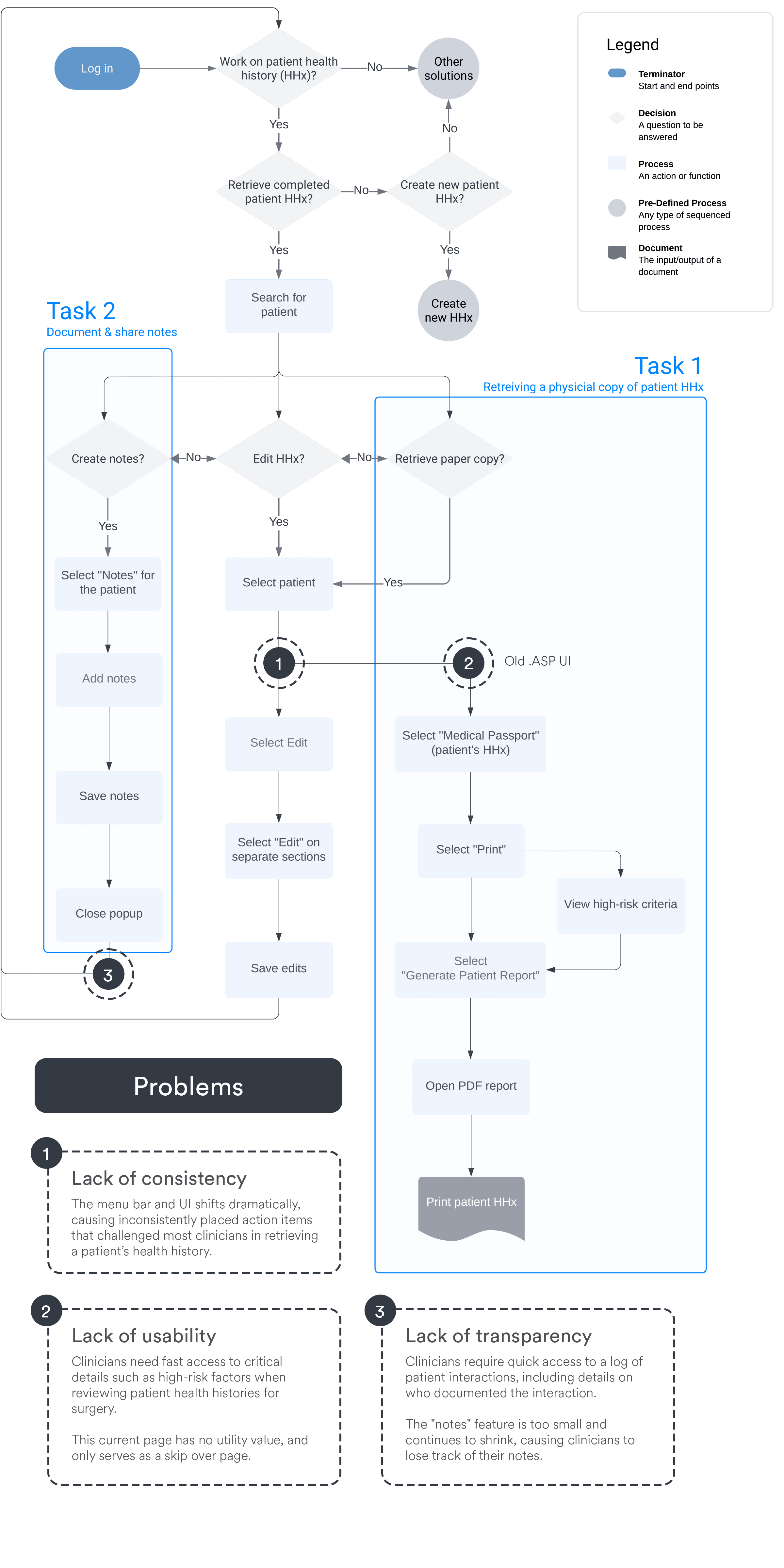
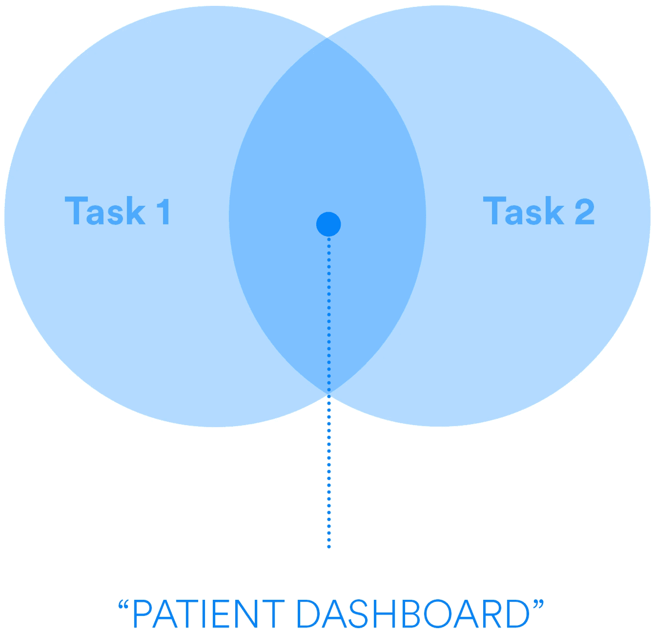
I conducted a legacy user flow analysis to understand the most common actions of our users. Within this analysis, I identified two main tasks crucial to their day-to-day workflow:
Task 1
Retrieve a physical copy of a patient's health history to evaluate for risk-factors
Task 2
Document and share patient interactions
Affinity Map
Utilizing an affinity map, I visualized the connections between user pain points, technology limitations, and our business strategy. This guided my design focus, ensuring alignment with priorities and maximizing impact, helping me to break them down into key tasks and their relative categories.
Key tasks
Retrieving health records
Assessing surgery risks
Documenting interactions
Categories
Business strategy & alignment
User experience
Technical
IDEATE
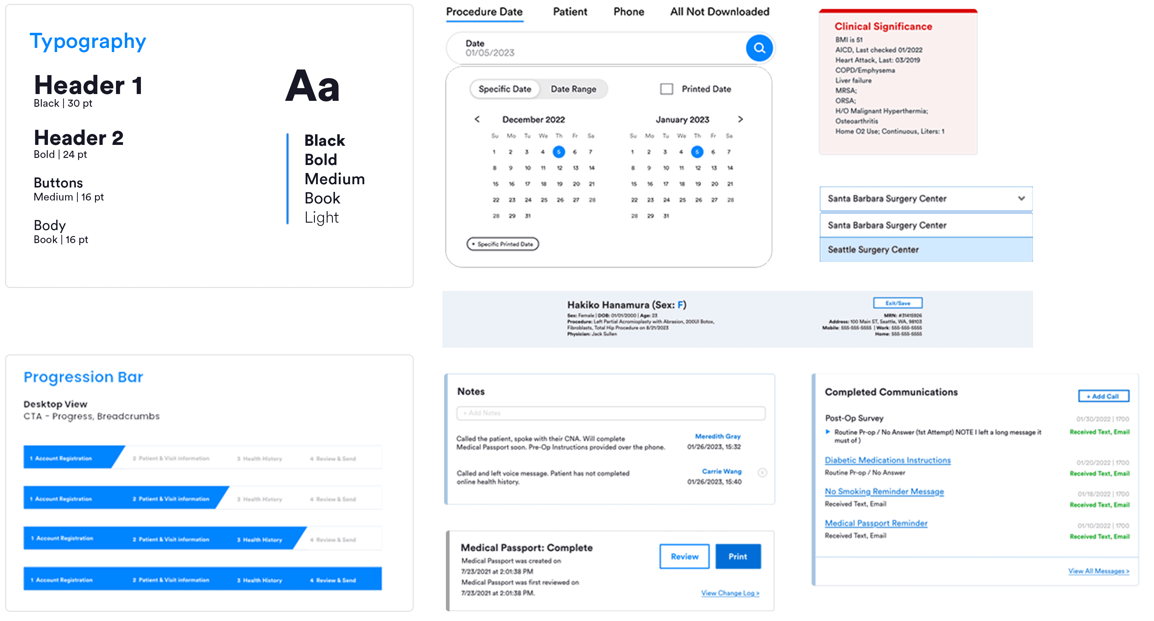
Design library
To ensure designs and platform consistency are align with the parent company's aesthetics, I helped develop a design system. This system features reusable components—patient name bars, modules, list items, and buttons—that maintain design consistency and streamline the design-to-development handoff process.
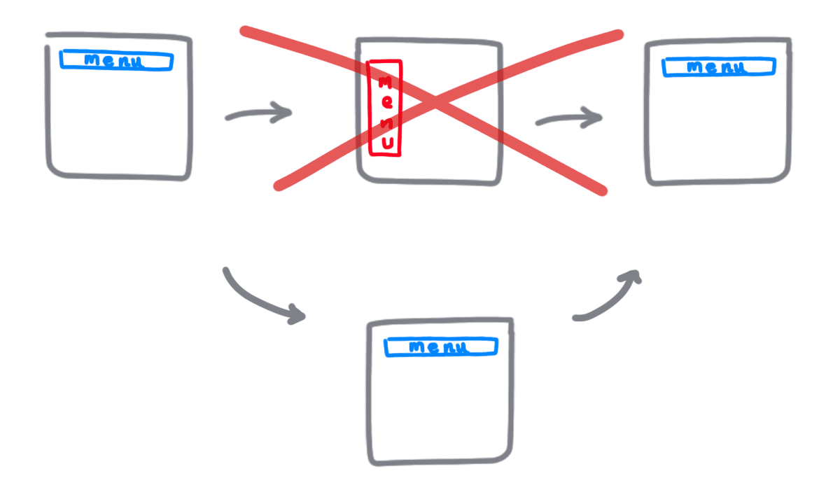
Design for consistency
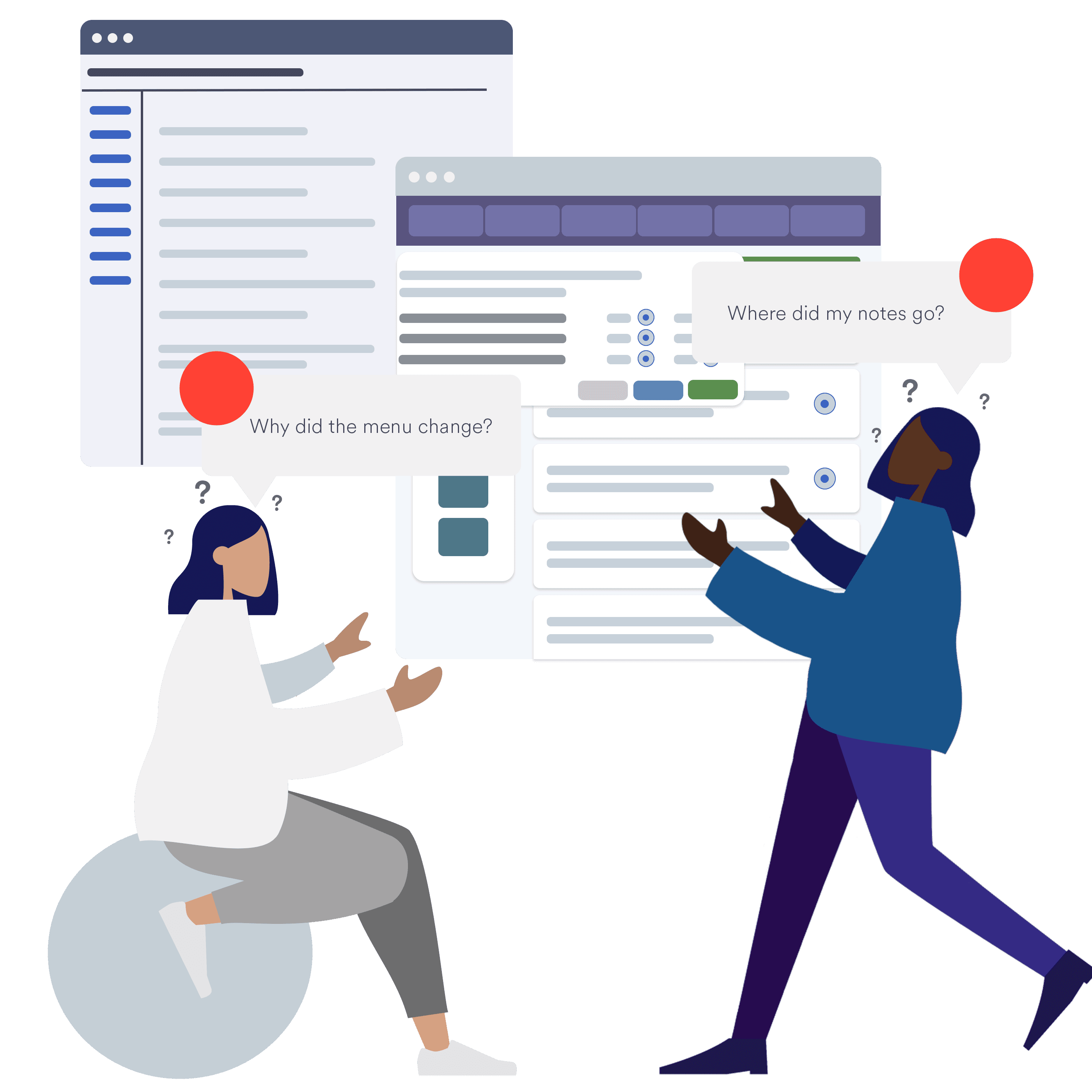
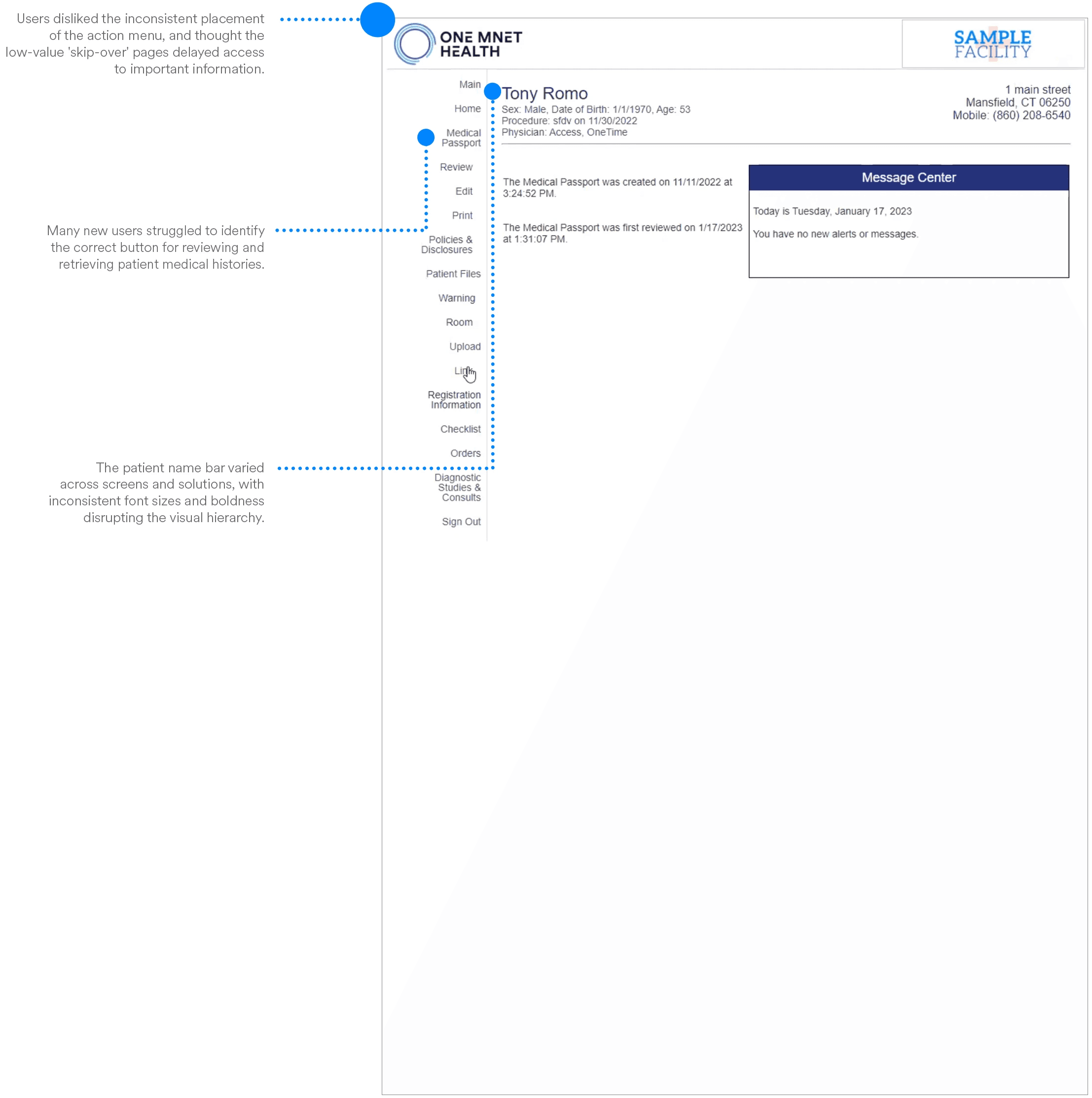
Shifting menu bar and inconsistently placed action items challenged most clinicians in retrieving a patient’s health history.
Task 1 Solution
Standardize the menu layout and design aesthetics for a consistent experience
Reasoning
Consistent design streamlines workflows, minimizes cognitive load, and enhances visual cue recognition, making tasks simpler for users. This efficiency reduces the need for implementation managers during client onboarding.
Design for usability
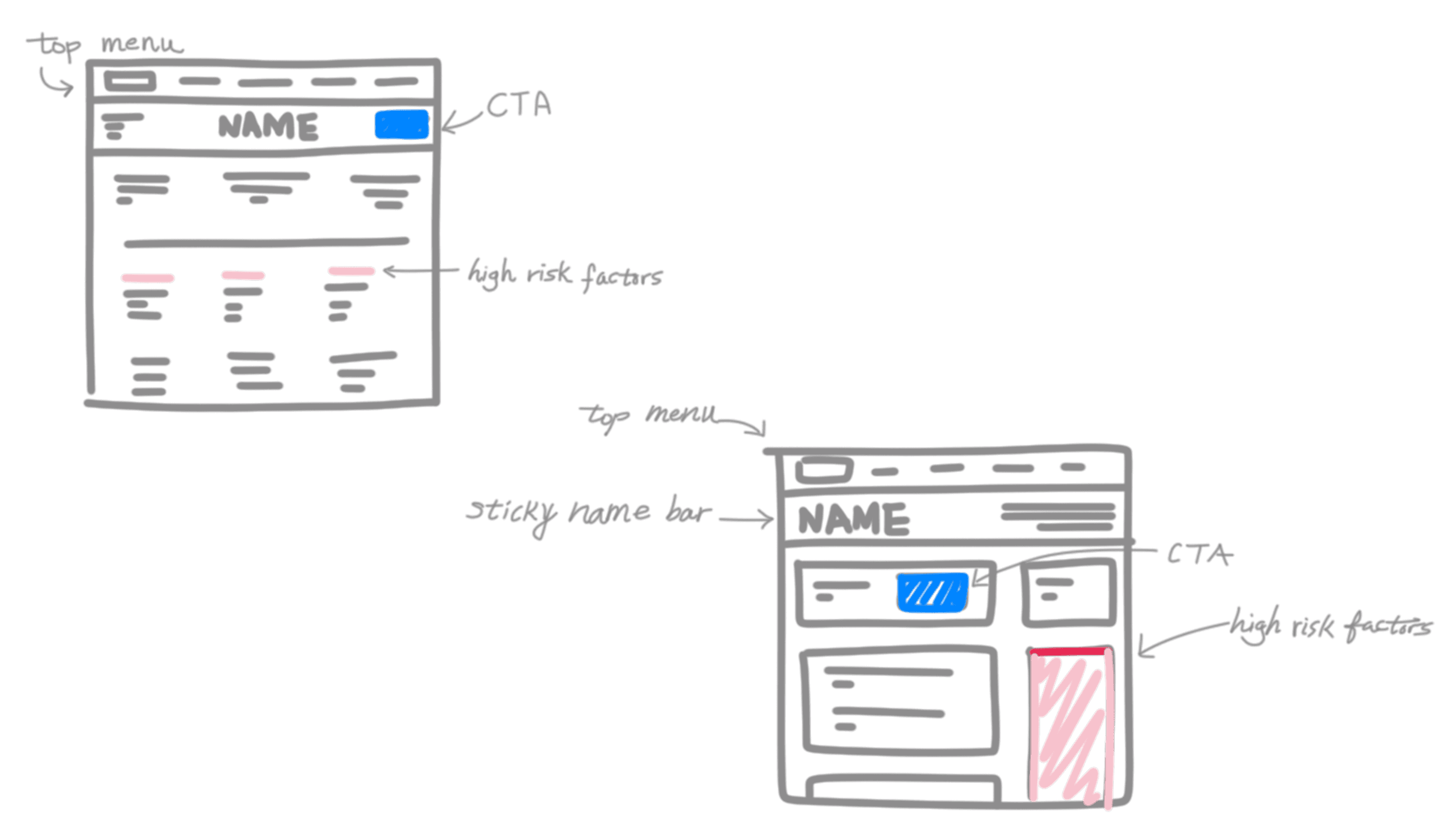
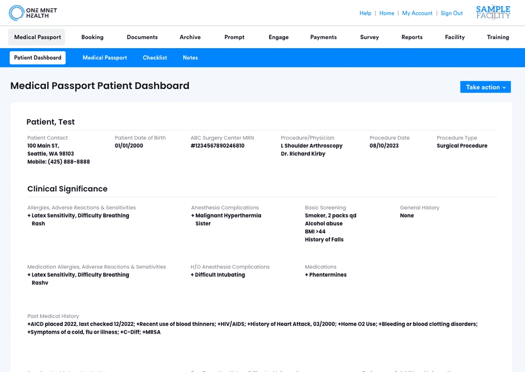
Clinicians need fast access to critical details such as high-risk factors when reviewing patient health histories for surgery.
Task 1 Solution
Create visual components of important clinical data in one page to enhance usability
Reasoning
By reducing choices and emphasizing clarity, we lower interaction costs.
Minimize clutter and simplify navigation can reduce the time users need to achieve their goals.
Use obvious CTAs to accelerate access to what users need, helping with the retrieval of crucial patient risk information for surgical decisions.
Design for transparency
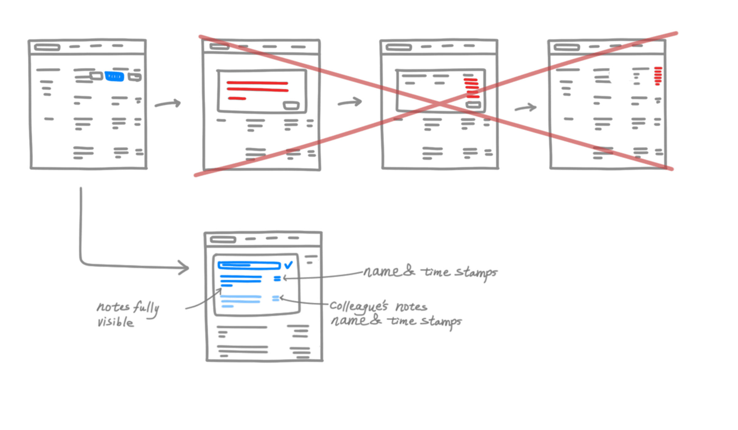
Clinicians require quick access to a log of patient interactions, including details on who documented the interaction. This is crucial for safe patient admission to surgery.
Task 2 Solution
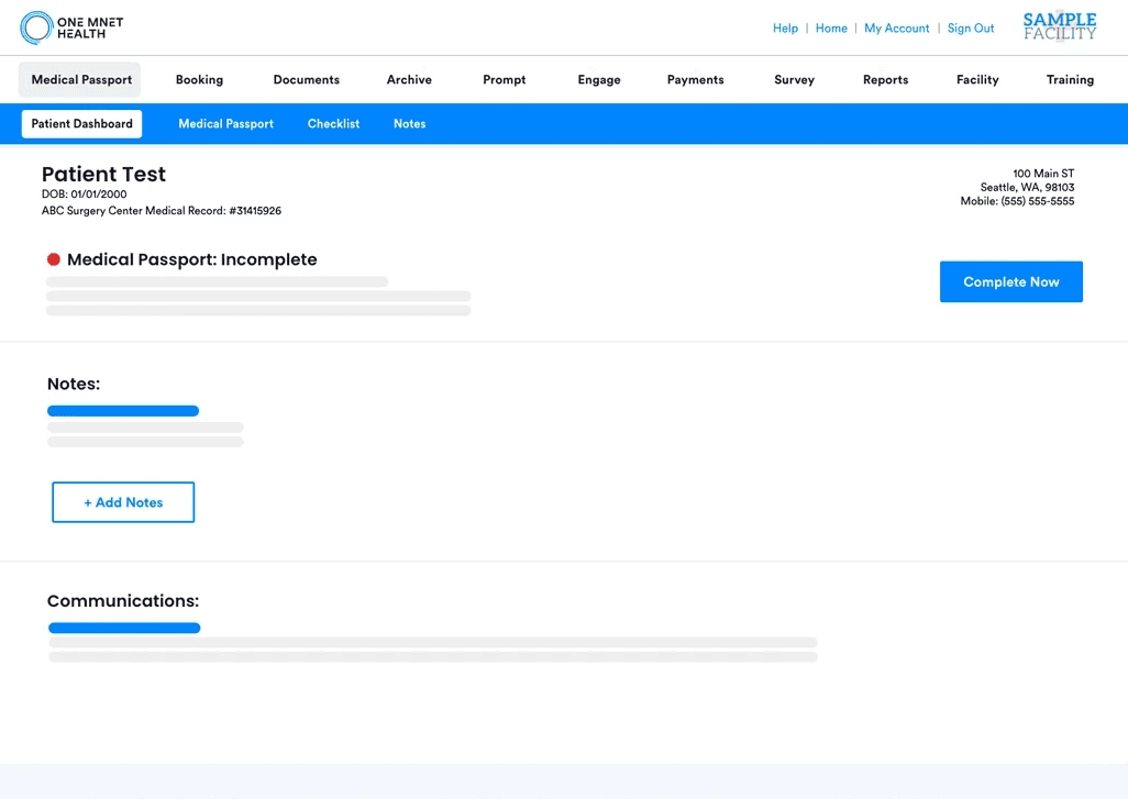
Add a centralized note creation/note sharing component, allowing it to take up more space in the page
Reasoning
Using the "Law of Proximity" from UX principles, the note-taking area was expanded and centralized. This adjustment enables clinicians to easily access and act on essential communications, improving workflow efficiency and patient safety.
PROTOTYPE
Using feedback and ideas received, I developed high-fidelity prototypes that made it easier to retrieve a physical copy of a patient's health history for risk evaluation & a place for patient interaction documentation all in one place. From this, the concept of a "Patient Dashboard" page emerged.
Design iterations
I documented the evolution of our design to optimize clinicians' interaction with the patient health history interface. This process involved several iterations that incrementally improved functionality and user experience.
Iteration 1
I started by creating a standard patient health history format. However, it lacked a consistent patient name bar and crucial visibility for clinician's notes.
Iteration 2
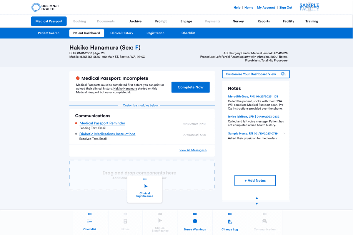
I gave the notes components more space and explored options to show the status of a health history's completion status, enhancing accessibility and visibility.
Iteration 3
I explored the idea of customizable modular components for users to tailor their views for patient cases. However, budget and time constraints prevented further exploration at that time.
Iteration 4
I went with the bento box layout to condense crucial information on a single page. This streamlined clinician's workflow by focusing on essential tasks of accessing patient health history, view risk factors, and manage notes.
Other considerations
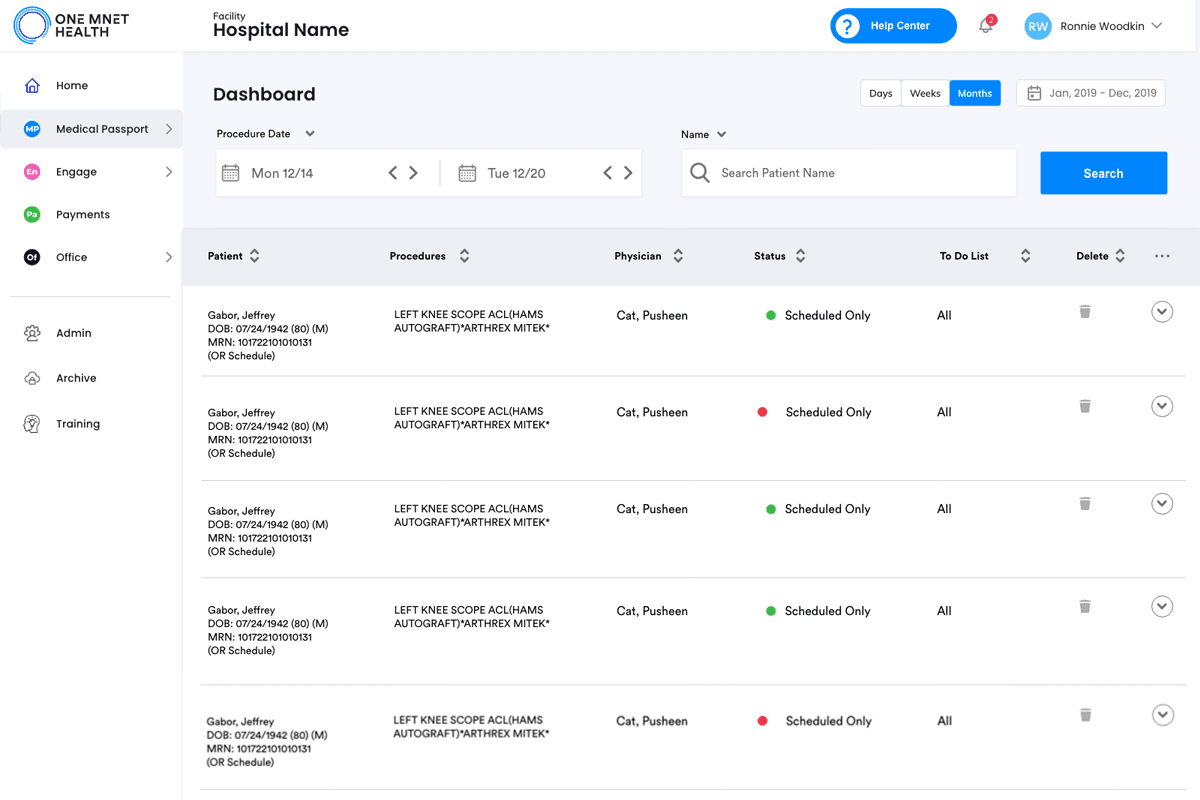
We explored additional designs for our Medical Passport's main page and a customizable patient dashboard. However, deeper user insights revealed that a complete layout overhaul could disrupt user habits and trust.
Decision – Did not pursue further due to potential user impact and high costs.
Customizable modular components concept
Sidebar layout concept
Final solution
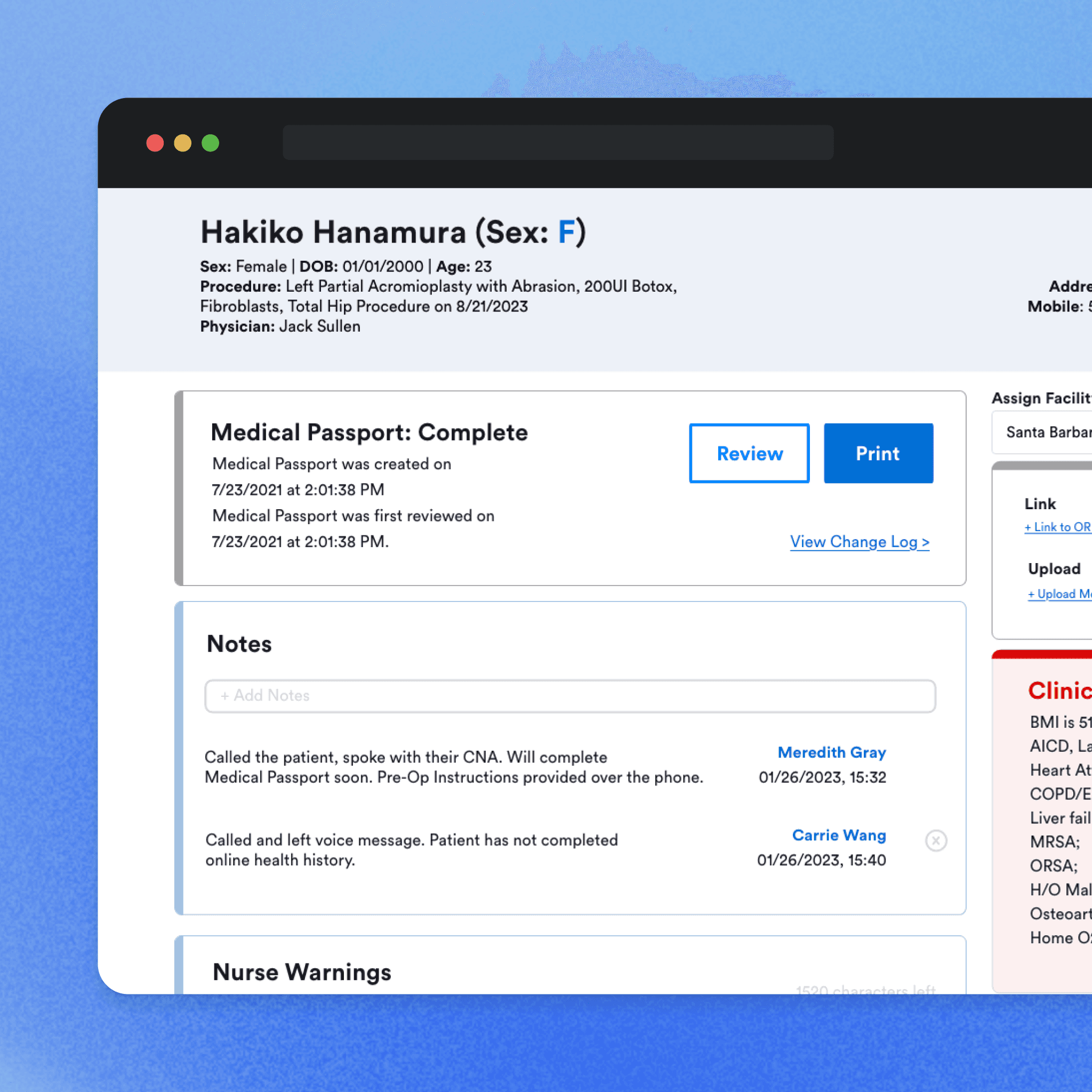
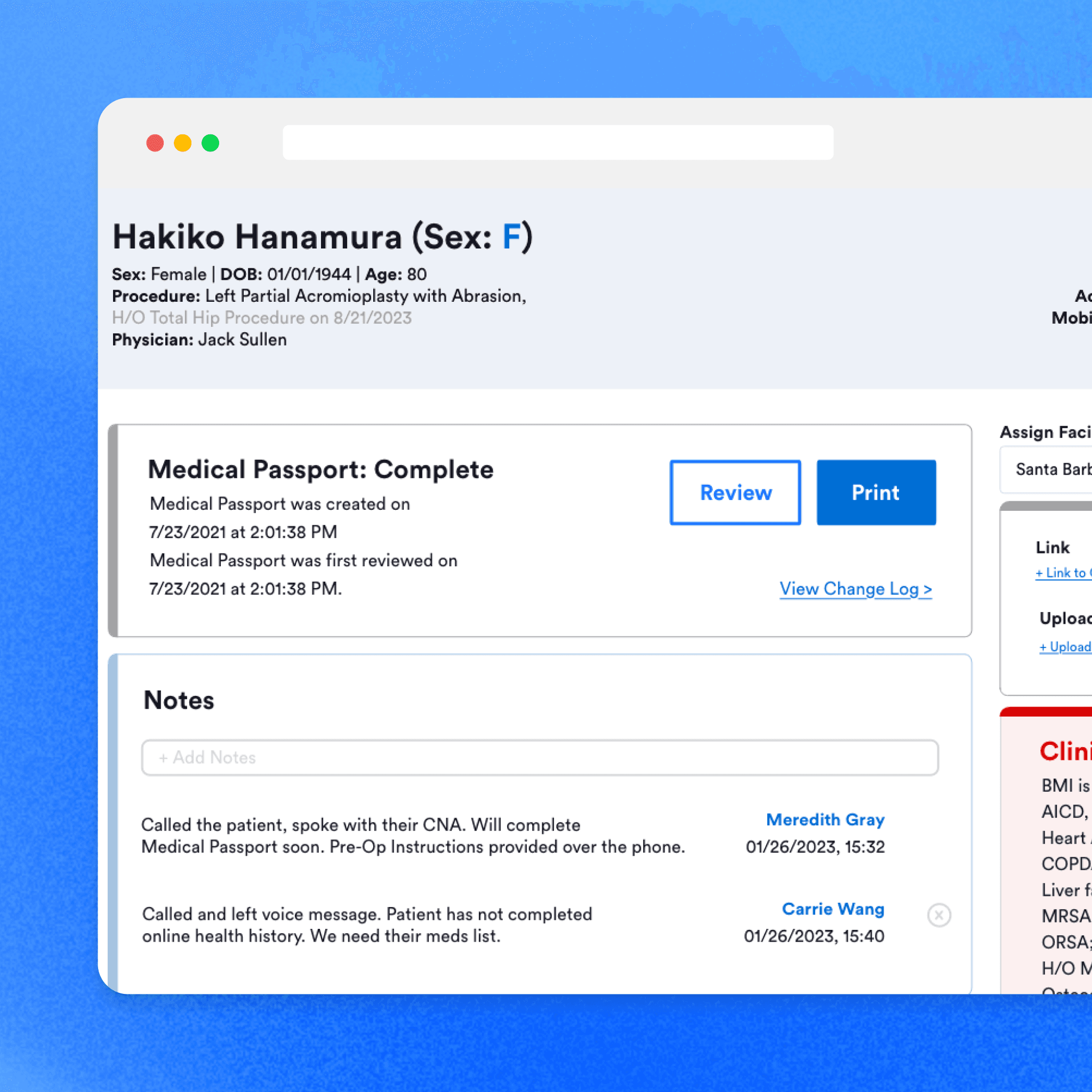
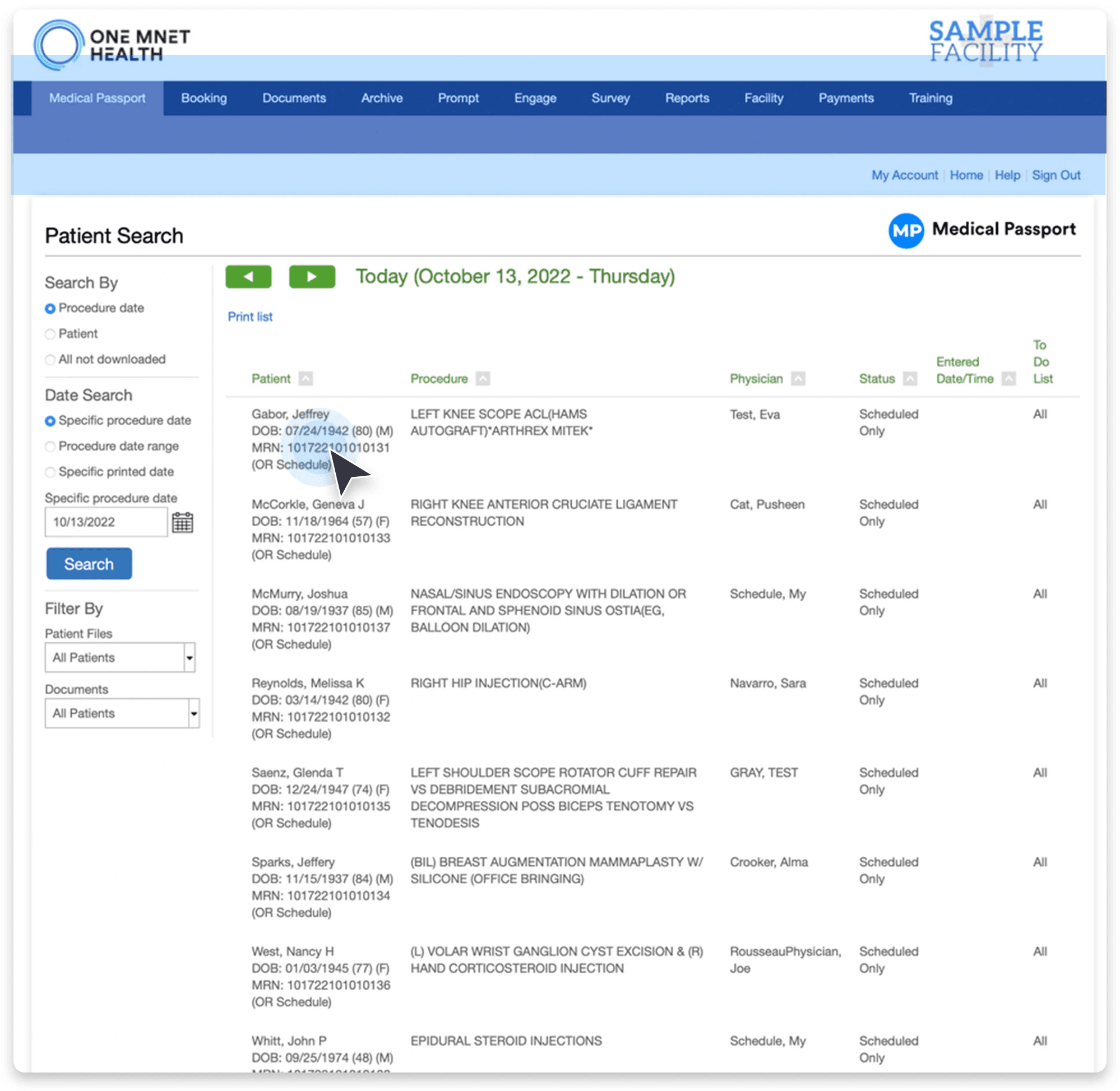
Below are comparison screens showing the original and the newly designed "Patient Dashboard" page that resulted from combining tasks 1 and 2.
Before
After
VALIDATE
Conclusion
I conducted usability testing with six customer success managers who use our facility portal, using a clickable prototype to evaluate my design updates. The results showed significant improvements in usability and efficiency:
Retrieving Health History: All six users reported that the process was easier than before.
Locate Patient Risk Factors: Five out of six users quickly found the "clinical significance" module within five seconds.
Create and Share Notes: All participants were able to access the notes feature immediately upon entering the page.
Locate Crucial Data: Every user could easily find the necessary information.
BEFORE
AFTER
Ability to retrieve a patient's health history w/o onboarding
Ability to quickly find a patient's risk-factors
Ability to find notes, create notes and share notes
Find important data quickly to determine case admittance
"I like how easy it is to use"
"The new page allows me to see everything I need at a glance"
Future considerations
With additional resources, I'd like to explore customizable dashboards to improve user experience without altering established workflows. Further research is also advised to collect better data from a wider range of clinician demographics.
TAKEAWAYS
Results
Post-implementation monitoring revealed a significant decrease in support tickets: an 8% drop in overall ticket volume, with a 13.5% reduction in tickets for updating health histories, and a 37.39% reduction in tickets for retrieving health histories.
Additionally, I played a key role in establishing our company’s first UX team. Collaborating closely with the marketing manager and a senior designer, I focused on data gathering, framing essential questions, and maintaining continuous stakeholder communication. This ensured visibility and alignment with our design strategies, leading to impactful outcomes.
8% ↓
Total support ticket volume
13% ↓
Notes documentation tickets
37% ↓
Health history retrieval tickets
Merged branding for
Consistent user experience
1st
UX design team established
Reflection
This project sharpened my critical thinking and human-centered design skills. Collaborating with business analysts and engineers, I gained insights from both business and technological perspectives, allowing me to refine our solutions for better user engagement.
Ultimately, I delivered a redesign that is both consistent and functional. The greatest reward has been knowing that my contributions will continue to support surgery centers nationwide.
My role has evolved into a trusted UX advisor within the company, with colleagues from other teams regularly seeking my input on UX matters. I take great pride in this recognition—it confirms the effectiveness and appeal of my work. ☺
Why this was interesting to me
The project holds personal significance for me. With a background in patient care and a passion for surgical procedures, I'm deeply engaged in this work. I've witnessed the challenges healthcare workers face with productivity software firsthand.
My approach combines scientific inquiry with creative problem-solving, aiming for designs that are compassionate and effective. As the project concluded, it became evident that it was making a positive impact - it was kind, helpful, and effectively solving problems for our clinicians.

