Portal Redesign: Enhancing Pre-Surgical Readiness for Patients


My role
UX designer
UX researcher
Project manager
Target users
Patients completing pre-surgical requirements and
mobile + desktop users
Outcome
12% ↑ in health history start rate
8% ↑ in mobile completion rate
Contribution
High-fidelity prototypes
Customer research
Stakeholder research
Usability testing
Project management
Duration
3 months
IMPACT
Results & metrics
+12% ↑
Health history start rate
+8% ↑
Mobile health history completion rate
BACKGROUND
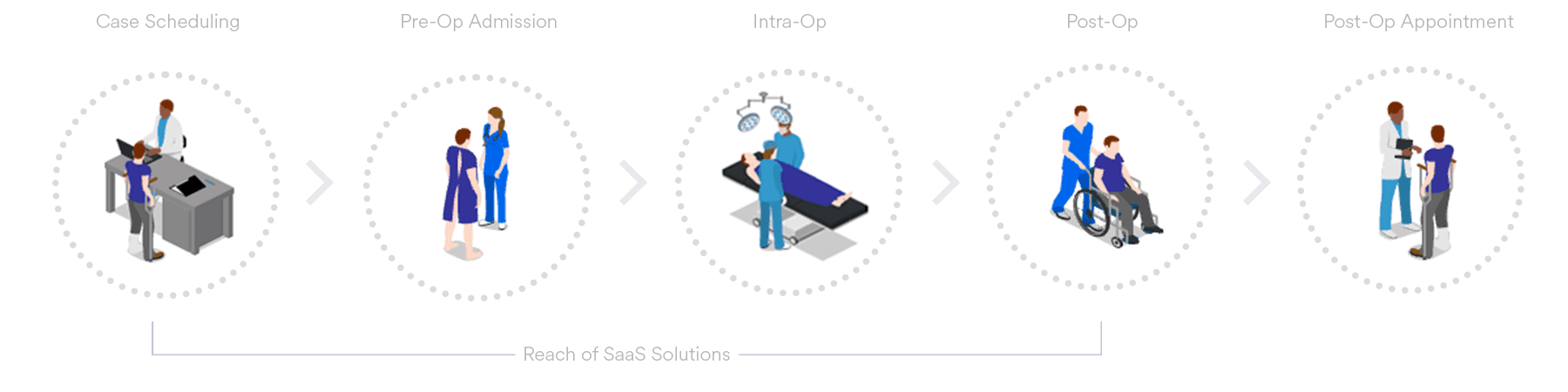
Surgery centers use One Mnet Health's SaaS platform to manage pre-operative workflows.
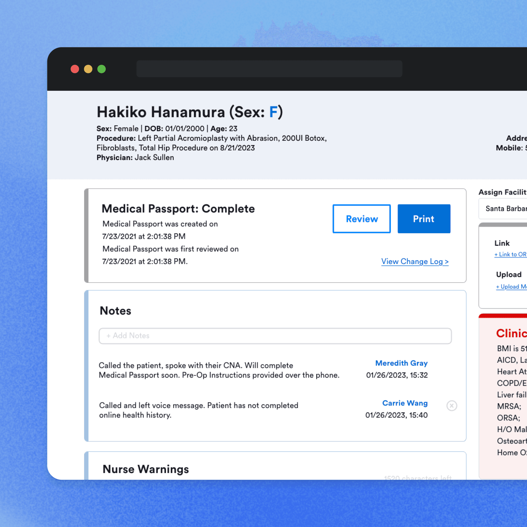
Before surgery, patients may be asked to log into the Patient Portal to complete their health history and other required pre-operative information. That information is then made available to the surgical facility, where clinical staff can review and manage it as part of the pre-surgical process.
The Patient Portal is therefore one part of a larger workflow involving both patients and facility staff.
Because the experience often occurs before an upcoming procedure, the portal needs to be understandable for users with varying levels of technical familiarity and accessible across desktop and mobile devices.
CHALLENGE
User challenges
Customer feedback and internal conversations identified recurring friction in two areas:
Accessing the portal: Patients encountered difficulties around logging in and accessing their account.
2. Completing their health history: The health history experience involved a significant amount of information and could be difficult to navigate or complete.
I needed to understand:
Where was the experience creating unnecessary friction?
Which problems were worth prioritizing?
How could we improve the patient experience while supporting the clinical workflows of our paying customers?
While patients used the portal, surgical facilities were the company's customers. Hence, I would need to consider their operational and clinical needs in my product decisions.
PROCESS
Narrowing down the scope
In the project's early stages, we had considerable freedom to identify user pain points within our solutions. I concentrated our efforts on the high-impact areas. Our Facility Portal and our Patient Portal.

Design process

RESEARCH & SYNTHESIZE
Researching two sides of the experience
"What am I supposed to do here?"
Defining the friction points
The existing portal worked, but the experience often required patients to interpret the interface before they could take action. From customer feedback and usability testing, I focused on reducing friction at several key moments.


IDEATE
Turning feedback into design decisions
I combined customer and stakeholder feedback with usability testing to identify where the interface created unnecessary uncertainty or cognitive load. I then translated those findings into a set of design principles.
Provide context before asking for action
I redesigned the entry experience to better explain what patients were doing and distinguish between new and returning users. The updated experience clearly separates the "Creating an account" v.s. "Returning to an existing account"
This reduced ambiguity at the beginning of the pre-admission journey.

Make the next step obvious
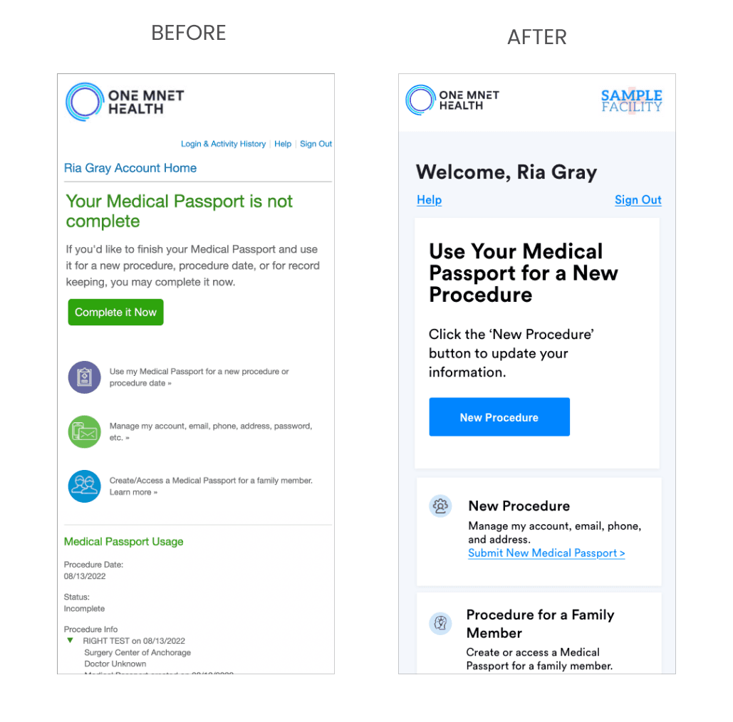
For example, the redesigned dashboard prioritizes starting a new procedure while grouping secondary tasks such as managing an account or creating a record for a family member into separate, scannable cards.
Reduce cognitive load through hierarchy
I reorganized the dashboard to create clearer separation between:
Starting a new procedure
Managing an account
Accessing existing Medical Passport records
By grouping related actions and establishing stronger visual hierarchy, patients could scan the experience more quickly and identify relevant tasks.

Design for responsive use
Rather than simply scaling down the desktop layout, I worked with an engineering counterpart to adapt the experience for smaller screens. This mobile redesign uses stacked content, larger touch targets, and clearer separation between actions to preserve usability across devices.
OUTCOME
Following improvements to the patient portal, we saw a 12% increase in patients starting their health history, and a 10% increase in successful health history submissions for mobile users.