East Meets West: Redesigning a Chinese Medicine Clinic’s Website for a U.S. Audience
Project type
Website translation and design
My role
Web designer
Translator
Target users
Patients around LA
Outcome
Responsive web design
Fully translated & localized
Contribution
中文→English Translation
Visual systems
UX Consultation
Duration
8 weeks
OVERVIEW
Client Introduction
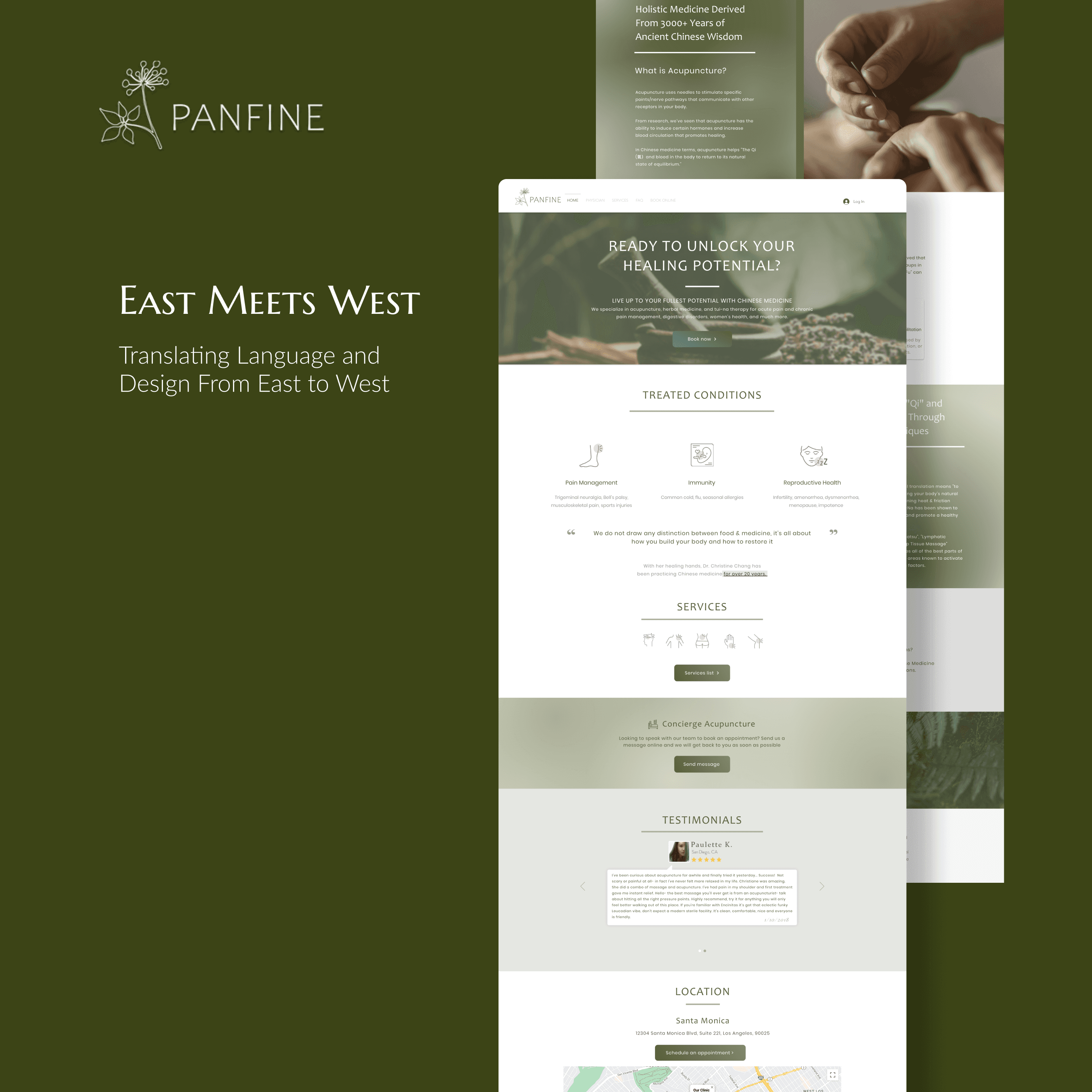
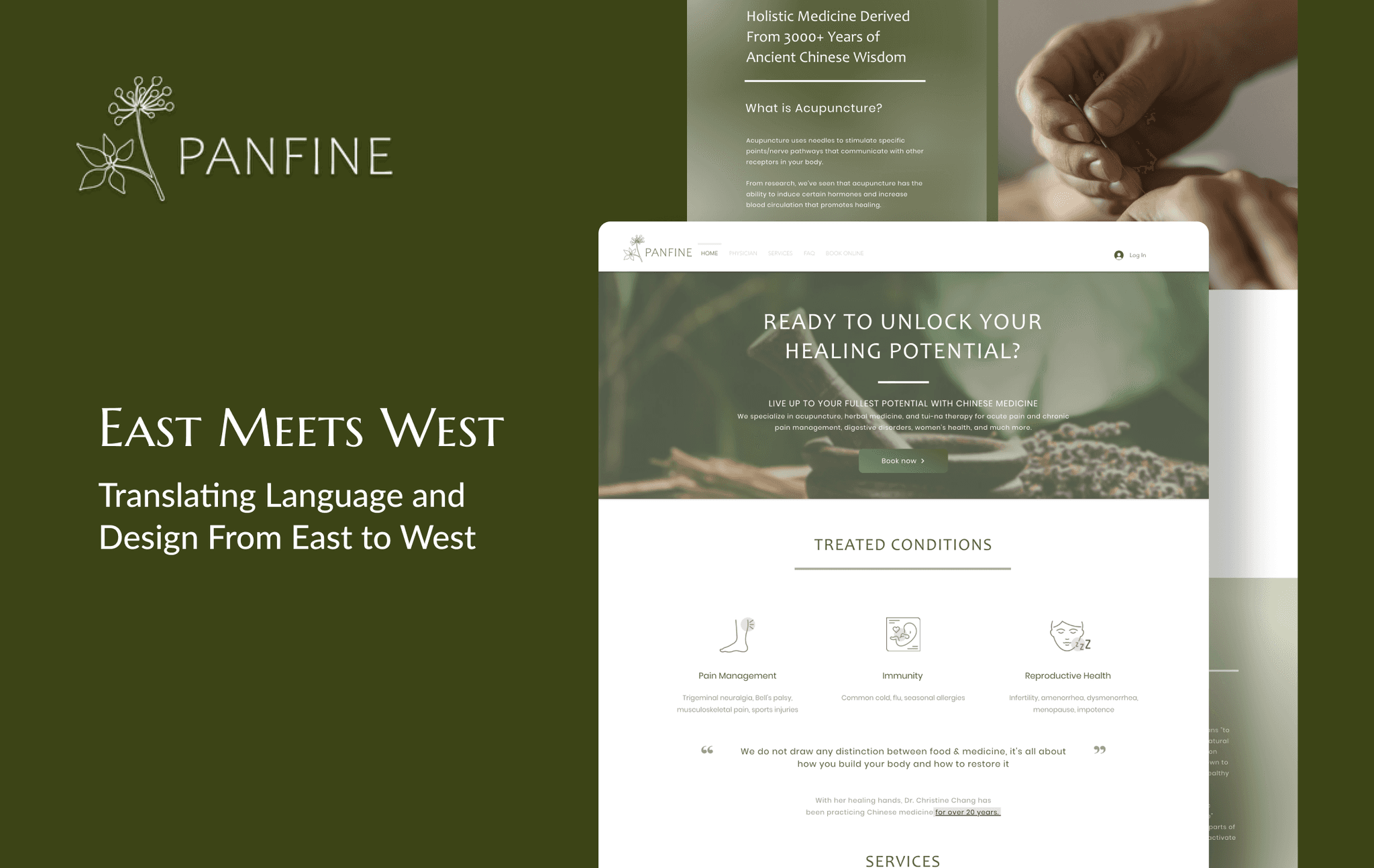
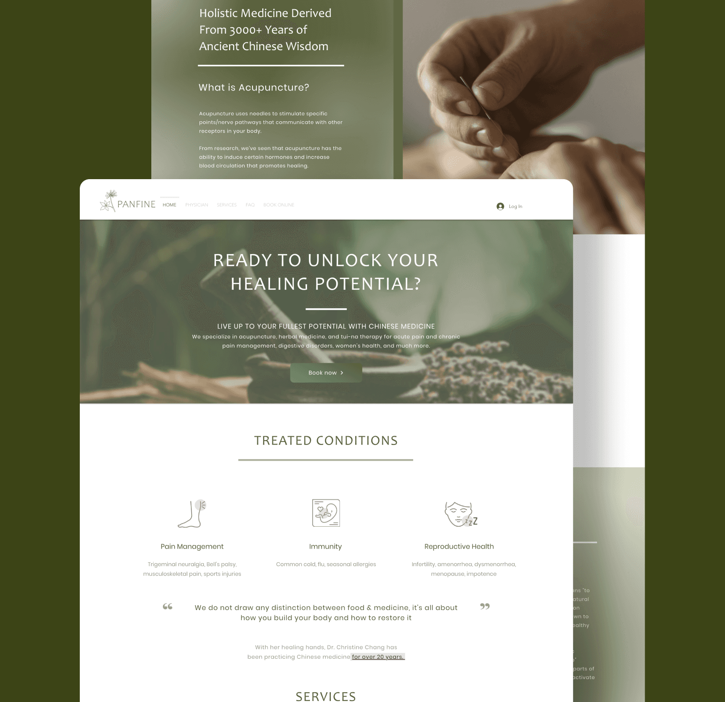
PanFine group is Chinese herbal medicine clinic based in Taiwan. Recent years, PanFine is expanding its reach to the USA, specifically in the LA metro area. They are wanting to gain more patients and build their brand identity to attract more western audience.
Current Experience
The website is the main platform for finding the clinic, which specializes in pain relief and wellness. I adapted the site for a Western audience by translating the content and modifying the usability to meet Western UX standards. Some major issues were:
Improper language usage
Unresponsive mobile web page
Overloaded menu information
RESEARCH
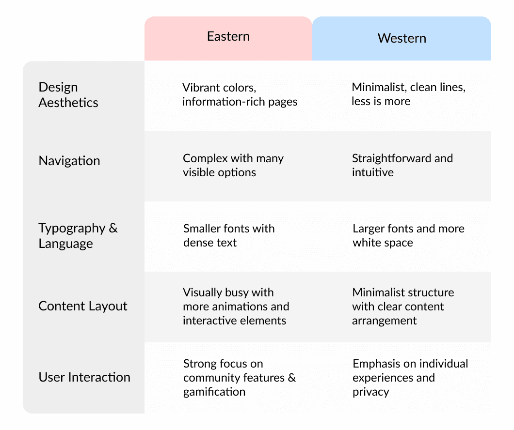
UX differences: East v.s. West
In my previous coursework, I learned that there are several differences between websites designed for an eastern audience, versus a western audience.
If you're interested in reading more, I recommend these fun reads:
(1) Contrasting UX Design: Exploring Differences between East and West
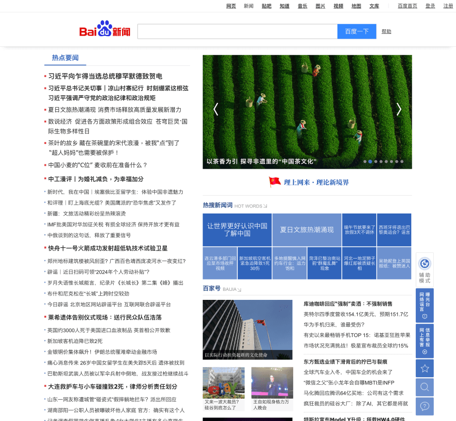
Baidu News
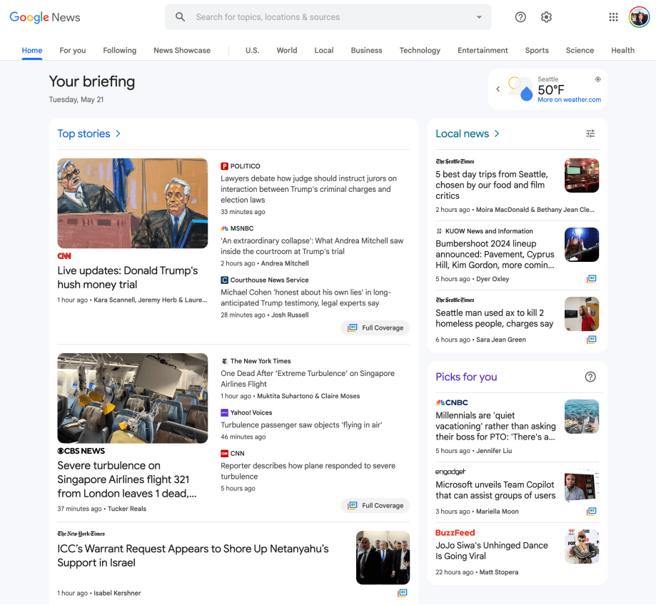
Google News
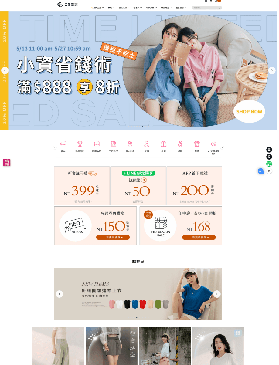
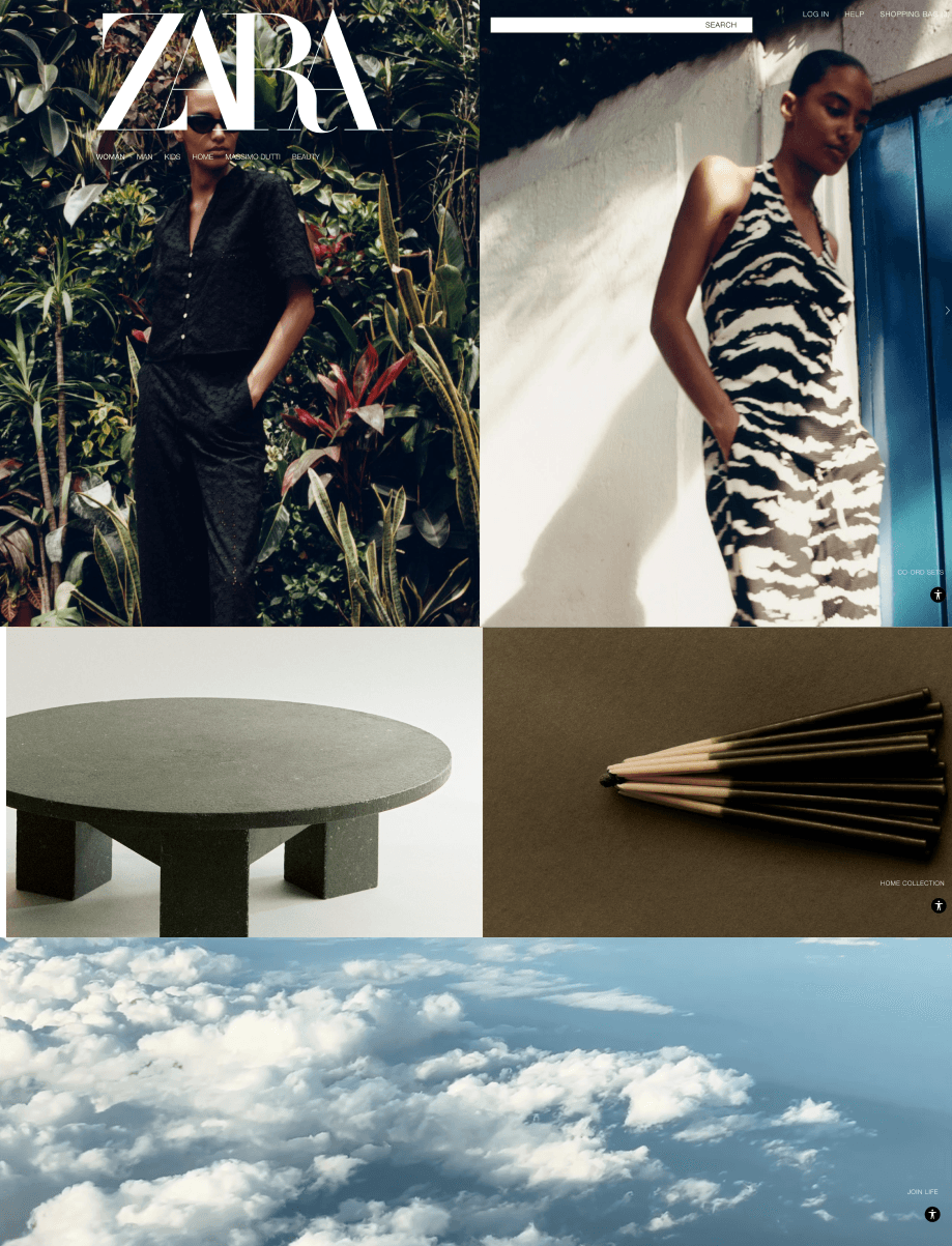
Popular Taiwanese Clothing Brand: OB嚴選
Popular Spanish Clothing Brand: ZARA
SOLUTION
Scope
After learning about their mission, I leveraged my bilingual proficiency in Chinese and English to translate their website and user experience, developing a modern visual system that appeals to Western audiences.
I also ensured the site was mobile-responsive, making it more accessible for patients on the go, and simplifying the appointment booking process.
Brand book
The clinic had an established logo and a clear vision for their website, aiming for a calming, herbal aesthetic connected with zen nature. Based on their requirements, I developed a color palette and selected typography to reflect this vision.